


2016
Agency client work • Genuine Interactive
Role: senior visual designer
Team: project manager, account manager, strategist, ux designer, ux director, creative director
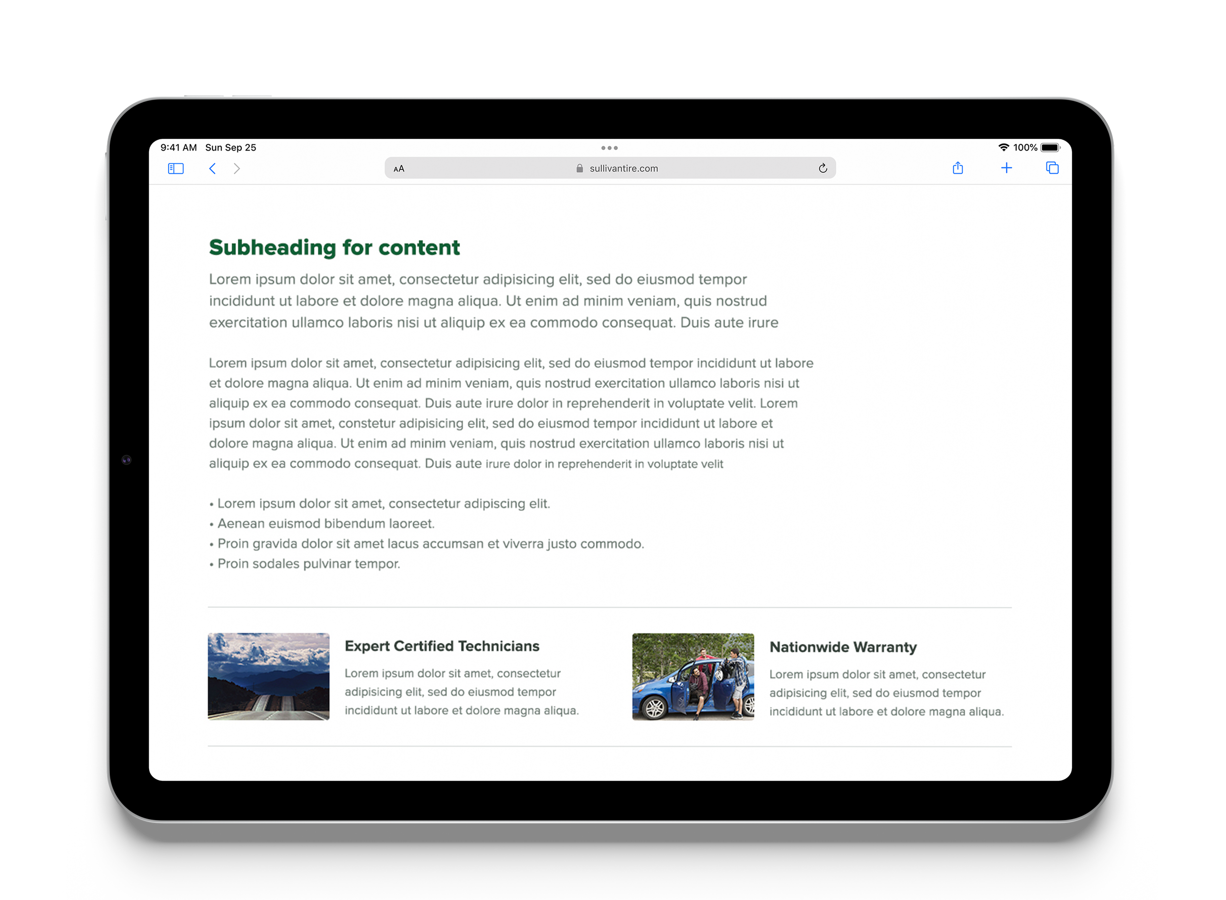
Ask: redesign SullivanTire.com
In collaboration with UX and development, we crafted a homepage experience that would give multiple entry points to the sales funnel. The primary CTAs were two-fold, a set of two drawers with a selection of auto services and a tire selector tool.
We designed a multi-interaction tire search tool with the option to drill directly to the sales/checkout page, to navigate to a more robust tire detail page, and the ability to compare a selection of tires.
To cater to a wide audience of car owners, I designed custom icons for all services and tire selection details. The intent was to make the brand appear approachable yet knowledgable without having to show complex diagrams or images of car parts.
Results (from the Genuine case study)
Winner of a 2017 w3 Silver Award
Reluctant customers have become returning clients. And that’s not all. We’ve seen: A 48% increase in average tire replacement and auto service appointments per day. 36% of appointments made via a mobile device, a feature that didn't exist on the previous site. User sentiment on social exploded with hundreds of positive comments about the new booking functionality.
Since the launch of Sullivan Tire, and having worked on new projects, I wanted to revisit this experience and do a redesign for my own personal design exploits. Enjoy.
1. Refresh the look and feel of the existing site for an already beloved offline customer-base.
2. To educate potential new customers on the service offerings that make Sullivan Tire a great full-service destination. They are well-known in the area as a wholesale and retail distributor of tires, but they want to tell the world digitally that they are in fact a reputable automobile servicer.
3. Make it possible to book appointments online, both from a desktop and a mobile experience. Taking a transactional type experience and transforming it into a digital customer relationship through an easy to use user experience.
One of the fun parts of this design project was the creation of a custom icon set for Sullivan Tire. This set included a set of icons specific to the automobile industry. They were generated with the idea that they would be paired with text. This allowed us to provide a visual language that was approachable to the novice car owner, and also ensured that these icons did not create more confusion than the expectations of how they would improve the experience for the broad car-owner audience.